Saturday, 25 March 2017

EVALUATION 10 - Brand Identity

 How have we established brand identity? Use screenshots to show how things like slogans were used in different productions to promote the film and establish brand identity.

In our overall productions (trailer and ancillary texts), we tried to focus a lot on creating a brand identity by which audiences would specifically recognise the film. A brand identity symbolises the films values/ideas and concepts. Films create a brand identity as a base to sell there products; any film needs a unique selling point in order to create a market for themselves in the film industry.

In our products, we feel like the main feature that is creating a brand identity for us is the use of the slogan 'Your fears are what you create'. We have used this title specifically in our trailer but then further incorporated it into our trailer poster. The effect of doing this is that audiences will recognise the film through having something to remember it by - rather than just the name of the film. The direct address in this slogan where we have used the personal pronoun 'you' is also significant in engaging audiences, and making the feel more involved and a part of the trailer. Through directly addressing the audience, our brand identity would essentially become more identifiable as they will be likely to remember their personal involvement/engagement in the trailer.


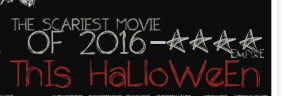
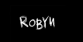
Many films incorporate a brand identity and this is important in film as you are advertising across multiple media platforms and would therefore want to create an identity for the film. As well as using a recognsieable slogan, the consistent use of colors, themes and font style will create a visual identity to which audiences would be engaged by and recognise. In both our trailer and our poster, we have incorporated the sketch like font and the effect of having this consistency of font style is that audiences will remember it and recognise it.


Another way in which we feel like a brand identity has been created is through the use of imagery in both ancillary texts. We have used an image of our antagonist in both pieces of our ancillary texts and the reason for doing this for both is to specifically create a brand identity for the trailer. The images that we have used in both are extreme close-ups revealing the antagonists face in a lot of detail. The close-up also reveals the direct eye-contact that is being made. This is effective in engaging audiences and making them feel involved; as well as creating a visual image for the audience to remember and with the women being the antagonist and key enigma character in our trailer, when it comes to watching the trailer, audience will recognise the character and may have already made assumptions of what her role may be as a result of viewing the magazine and poster. The positive effect of making audiences think this way is that it will be the case of them being able to associate a thought or assumption with our trailer and we feel more engaged and intrigued by it; and as result will remember it - creating a brand identity.

It is also recognisable that the facial expression of the women in both is the same/very similar and the effect of this is again that audiences will remember it - for being quite an eerie look, conventional of a horror. The black and white effect that we have incorporated into our poster follows the theme of contrasting colours that we have used throughout making it rememberable for audiences.

Friday, 24 March 2017

EVALUATION 9 - Voice-over


Initial filming of the voice over:

"The trailer commences with two innovative institution titles unique to our product, unlike institutions such as Blumhouse or Twisted Pictures our media distributors are unique and intriguing from a small budget basis that may entice audiences. The glitching effect and fade to black we have used reinforce the horror nature of the film."

"The initial scene with the opening of the wardrobe from a mysterious entity creates an enigma in the trailer from the very beginning. It takes audiences through just one prevalent scene to the film rather than using a montage effect with many alternate clips from the films entirety, and in this way keeps audiences hungry for more."

"The titles breaking the continuity and flow of the scene reinforce tension as audiences are kept in tension at what is kept in the dark, what is hidden- reinforced by our black colour scheme for title and credit appearances. The credits maintain a cinematic style for the trailer, as well as ensuring we are not breaking continuity rules or making jump cuts that do not fit well together."

"As we follow the protagonists journey to the toilet with tracking shots and pans, audiences can relate to the film as they will be feeling vulnerable just as the young girl is - reinforced through mis en scene with her childish pyjamas, juxtaposing the attire of the old lady draped in lace."

"The scream scene is designed to create a massive Ronda or change of tone in our piece with a breaking of the equilibrium linking to Todrov's theory, and the rising volume and pitch levels create a dramatic jump, scare effect."

"The final part of the trailer with a montage of abstract imagery is overlapped on premier elements with the ghostify effect and fits codes and conventions of horror trailers having mili-second shots of different juxtaposing imagery- like the blood down the plughole contrasting with the daffodil imagery to give a three dimensional, depthful feel to our movie with some of these fast paced scenes."

"The girl scribbling 'help me' is filmed from three different angles; point of view, close up and extreme close up - making it prevalent to the final scene. It also reinforces that she is possessed with this similar scene in movies such as orphan. Through speeding up the shot with the time tool on the software, we were able to make the girls movements seem abnormal."

"The white noice and grainy imagery on screen interrupting the film footage connotes breakage and damage, making our film seem realistic, and to affect the audience more subverting from Maslow's need to feel safe, as audiences will be unsure what is going on, and contrasting this idea of safety is a key feature of horror movies."

"Finally, our finite end to the trailer uses a rendition of a child's nursery rhyme with an eerie tone; this creates a distorted theme of childhood nightmares to our film, and is effective as there is little dialogue and the absence of the child's voice throughout most of the trailers entirety so hence this will be memorable to audiences. The final credit finally reveals the name of our piece, so the enigma of the films title revealed - and the title 'DAWN' as a homonym makes audiences associate the film with the rising of the day or contrastingly the archaic old fashioned name... either way, audiences will want to find out more."

Thursday, 23 March 2017

EVALUATION 8 - Annotated trailer

YouTube annotation tool. Write about shot types and editing throughout our trailer using the annotation tool.


Wednesday, 22 March 2017

EVALUATION 7 - Institution analysis

How did we create our own production titles and how did we place them conventionally in our trailer?


ROBYN PRODUCTIONS:

The inspiration of using this specific name as our institution is from our AS production. In our AS production, we created an opening two minutes to a film and titled it 'Robyn' which was the name of our main character. The effect of having this as an institution title in our trailer is that it will essentially create a brand identity for the film; the way in which this would be created is that audiences who have viewed our opening two minutes will recognise the title and if they enjoyed the opening they will be likely to watch our trailer. We created the font of 'Robyn' using an online font website to which we were able to look through which we felt was most conventional and effective of a horror. We feel like the specific use of font we have used is conventional and the sketch-like look could create a link with the child as if it was in there writing.  The basic but obscure colors of the black background and the white font contrast one another well; with black connoting evil, death and darkness in contrast to white, connoting innocence and purity; it is effective to use the contrasting colors as it firstly stands out a lot and is prominent on the screen. Additionally, we could specifically create a link with these two connotations and our two characters where they are binary opposites and create the idea of good vs evil; similar to what our title's contrasting colors suggest. To present this institution, we used the transitions that were provided on the Premiere Elements Software; and the specific transition we used was the slice tool. This transitions created a cutting effect as the title was partially thrown on to the screen; and this was significantly effective as the cutting transition creates the fear of danger of which is conventional of the horror genre.

DIM LIGHT FILMS

The initial idea of using this as an institution name was that we filmed the blowing out of a candle as one of our preliminary filming's. We felt like this would be effective to use as it creates a sense of fear and the change from light to darkness would set the audience to panic as they would be curious as to what is going to happen. We struggled to find a place for this specific filming in our overall trailer so decided to use it as part of our institutions which is where we came up with the institution name. Again, the colors that we have used are contrasting one another creating the effect of binary oppositions and for our trailer specifically, good vs evil. The title of the institution appears through flashing on to the screen in front of the filming of the candle.. The specific font we have used is basic but is prominent and the use of capitalisations makes it stand out to audiences. The letter 'H' is a different color to the rest and the reason for this is the background lighting of the candle making it more difficult to see in a white font.

The way in which we have incorporated the institutions is effective as they are both at the beginning of the trailer making audiences immediately aware of who has created what they are watching. We feel like we have placed them conventionally in our trailer where you would commonly see them at the beginning, where we have placed them. Also, they are only shown for an extremely short period of time and this is further conventional of a horror where clips and scenes are very shot as in a trailer, the aim is to incorporate as many events and stages of the film as possible; creating confusion for the audience as they would be overwhelmed with the amount of  things that are occurring and would therefore be more engaged. Overall, we feel like presentation of our institutions is effective but also the way we have done so and where we have specifically place them is conventional of a trailer.

Tuesday, 21 March 2017

EVALUATION 6 - Narrative

How did we establish the narrative in our trailer and what is established in the other two productions? How do they work together to sell our product?

The narrative is the way the different elements in a story are organised to make a meaningful story. Narration is how the story is told, how the information is presented to viewers, for example visual style and point of view the story is told from.  There are four different structures of narrative, of which are Linear/chronological, Non-linear, and cyclical or can have single/multiple viewpoints.  Our trailer adopts the linear/chronological structure where the events that occur are ordered and follow to create the story; however this chronological structure has been broken apart with the use of titles in order to create the trailer composition.  

In our trailer, we have specifically used an omniscient narration, where we see events from multiple viewpoints. This can add suspense and appeal to audiences as they are made aware of events/information that other characters may not be.
We further looked into Claude Levi-Strauss’ theory of binary oppositions. He studied how the world is arranged in terms of oppositional forces and values. He was also interested in the order of how things happened, but more focused on the arrangement of their oppositional themes in a media text. In our trailer ‘Dawn’, we portray the representation of binary oppositions through the two characters and their contrasting ages. The specific depiction of these two characters is the good that is shown through the young girl and the evil that we see through the elderly women. The good and evil show a clear opposition between the two characters and this would conform to theorist Claude Levi-Strauss There is also binary oppositions in their ages where they are juxtaposing one another. Both characters are at opposite ends of the spectrum; with the girl being a young child and portrayed as innocent and vulnerable, in contrast to the elderly women who is being depicted as evil and eerie.


Through ending our trailer with the girl going through a possessed episode, we are able to relate to the theory of the enigma code, proposed by Roland Barthes. The enigma code refers to any element of the story that is not fully explained and hence becomes a mystery to the reader. For audiences, they have viewed an unexplained event and this would therefore encourage them to want to watch on to find out what and how it happened. In relation to this specific event and the character, we also used Vladimir Propp’s theory to help us decide on the kind of representation to use and the role that the characters were playing in our trailer. He suggested that characters took on the role of narrative ‘spheres of action’ or functions. He came up with eight key characters types in a narrative; a few of which we have implemented into our trailer. With this specific event, we are able to relate to the false hero. The description of this is that they appear to be good but are revealed, at the narratives end, to have been bad. It is often the case that characters fulfil more than one sphere character type. In our trailer, the young girl starts out to be innocent and vulnerable when she is found in a difficult situation in her own home. Throughout this build-up to the point where she eventually sees the antagonist, she is portrayed as a scared, innocent young child; however by the end of the trailer, she is shown to be possessed and quite violent with her actions when slamming down her head on the table. Therefore conforming to the false hero where she ends to be revealed badly.

Our ancillary texts work well together to sell our products and a key feature that we thought this most applied to was the use of the slogan on our poster which was 'Your fears are what you create'. This slogan was significantly effective in selling our product as it essentially produced a brand identity; a feature which audiences remember our film but and identify/associate us with. Another way in which we though our ancillary texts contributed to the selling of our product was through using the images of our antagonist. The effect of this is that the elderly women is a key character in the trailer and therefore audiences will know/recognise her character when it comes to actually watching the film. Lastly, the appealing use of font is effective in selling our product as it is prominent on the background making it stand out to audiences and for audiences to recognise. The bold font and capitalisation of letters makes it more noticeable for audiences to remember; and therefore selling the product well if audiences will purchase it and further go to watch the film/trailer.

Monday, 20 March 2017

EVALUATION 5 - Trailer expectations

How have we made our trailer seem like a trailer? How did specific moments appeal to the target audience?


With our trailer, we used a continuous method of filming where events took place in chronological order, creating the story-like feel for audiences. This typically would not seem like a trailer as it is often that trailers are just a montage of different events (not making sense), however we managed to convert this by adding titles; by doing this we were breaking apart the continuity of the film, emphasising the trailer feel. 


Titles:

In a trailer, titles are extremely important in promoting the film but for us; particularly breaking apart the story-like feel and continuity of events. The first titles that we included were of the institutions which were only briefly revealed; in trailers the display of institutions is much shorter than those in the actual film as they focus alot more on displaying multiple events. Our next two titles are slogans for our film, which are briefly guiding audiences through the trailer. The first one is 'Sometimes our worst fears'; and the effect of this is that audiences are unaware of what is meant by that; also the use of the collective pronoun 'our' contributes to engaging audiences as they are making them feel a part of the trailer by using direct address. These title significantly broke apart the continuity of events in our trailer. Another title that we incorporated which is conventional of a trailer was the time of release stating that it was 'This Halloween'. This is important and recognisable in most trailers as it is a key piece of information that distributors want audiences to remember. Lastly, we displayed the Title of the film and the credits. In the majority of trailers, these tend to be at the end as they are again things that we want the audiences to remember. Most importantly is the name of the film which is 'Dawn'. This is the main thing that we want audiences to remember and is what audiences should know when it is released. This is conventional in most trailers and was something that we recognised when analysing other trailers prior to creating our own.

Camera:

In most trailers, the camera movement tends to be very fast-paced and this is due to the multiple events that are combined together. The reason for the fast-paced camera movement is also to engage audiences and keep them on the edge of there seats when in-taking all the events that the trailer distributes. In our trailer we have actually subverted to this when using quite slow-paced camera movement, however this was to convey our genre and create tension to which you would expect in the horror genre. In our trailer, we have used a range of different shots and angles including, mid shots revealing body language and actions, close ups, over the shoulder shots, mirror shots, POV, etc. All of these were effective in engaging audiences which is the general purpose of a trailer. We aimed to use as many different shots and angles as possible in our trailer in order to show the change of atmosphere and to create meaning. A specific moment in our trailer that we feel would be most appealing to audiences would be the change in camera movement where it became much more fast paced creating tension for the audiences and unexpected change causing them to question everything they have seen.

Editing:

Typical editing, expectations of a trailer involve a lot of fast-paced editing and jump cuts from different clips. In our trailer, we initially began using quite slow-paced editing where each clip slowly faded in and out creating quite a suspicious atmosphere; along with the slow, eerie music. When changing through the different clips we used the fade effect creating a connection rather than it being a solid cut. This is important in trailers as there tends to be alot of jump cuts between the different clips and it is most effective when this is done smoothly using the fade transition or any other. The fade effect after each clip is effective as it essentially closes the specific scene creating suspense as audiences will begin to question what is going to happen next. We used the dip to black transition between the first half of our trailer which is quite slow-paced and eerie - to the end of our trailer which is much more fast-fast paced and intense. This was effective as it was closing the scene making audience think that its the end when the sudden fade was the cause of another event to start which would exhilarate audiences. This is conventional of a trailer as we typically expect a complete change of scene and events to which we don't find much out about.


Overall we have made our own trailer seem like a trailer through the constant use of title's and the complete change of scene and events from the beginning to the end. The use of titles significantly breaks apart the story-like feel and the continuity making it feel more like a trailer. Also, the titles are effective in advertising the film which is what you often expect in a trailer.

EVALUATION 4 - Film Poster and Magazine

How alike film posters and magazines are our ancillary texts? 

`

Poster:

When constructing our film poster, we wanted to make it look as realistic and alike a film poster as possible; and to do this, we analysed a few film posters - identifying the key features  that are most appealing and effective to audiences. The key focus that we found in most posters and is the one thing that should be most appealing is the image. We found that in the majority of the posters that there was only one image and this tended to be of the main character. The effect of having only one image is that audiences will have one focus and will be more engaged with it rather than having multiple small images. The use of a close-up shot is prominent and the direct-eye contact in the image is significant in captivating the eyes of the audiences. The effect of using one of the main characters in our trailer - and is the case in many other films - is that when it comes to watching the film, audiences will remember the characters and will have some recollection or recognition of who they actually are.

The title is one of the main things that you expect to see on a film poster as it is something that is promoting our trailer - and therefore, the title is the key thing that we are going to want audiences to remember when it is released. When analysing other texts, we recognised and followed the presentation of the title being prominent to audiences. Our poster clearly presents the title of our film, with it being in a bold-like font, with the capitalisation of letters. Also the white font on a black/white background able's it to stand out much more with the contrasting colours. In relation to titles, we decided that it would be most effective to include a slogan/phrase on our poster. This was something that we did not see a lot of when analysing other ancillary texts however we thought that this would be something that would make our own original but that would also create a brand identity for our film - as other than the title, this slogan/phrase would be something that audiences would remember our film by. The slogan we have used is 'your fears are what you create' which is a phrase that also appears in our trailer and would therefore be something that audiences will remember and associate our film with.

The final expectations of a poster that we followed were the release date and the credits. With a poster, you don't tend to want to see the further information of the film - and for this reason, these are in a smaller font. A poster is something that you would typically display or keep as a memorabilia of some sort - and therefore, you wouldn't realistically want to see all the credits and the release data. However, this is important information for the distributor's as it is information that you want audiences to be aware of.  Overall we thought that the way in which we presented our poster, with using an eye-catching image and a prominent title and slogan, allowed us to engage audiences and we thought it was very alike other film posters as we aimed to follow their ways of presenting - whereby we analysed many posters prior to creating our own.


Magazine:

Alike with our poster - prior to actually creating it, we analysed many other film magazines to get a basic idea of what the key features were and how we should incorporate them into our own. We found that the most prominent feature on the majority of magazine texts was the company name. The reason for this is that they are the ones that are publishing our trailer - and depending on the popularity of the magazine company, they are essentially the cause for engaging audiences. This would be because there are often audiences that make regular purchases of specific magazines - and therefore if our film is being promoted on there, the company will be wanting to take credit for that promotion. We followed this by presenting our company name 'Illumination' in a big, bold font - prominent to audiences.

Another key focus that we found in most magazine covers was the use of imagery. We found that in the majority of magazine covers that there was only one (often two) image(s). The reason for this is, similar to posters, that there is only one focus of which audiences will be engaged by and will most likely recognise. Again, alike film posters, this image tends to be of the main character of the film - allowing audiences to recognise the character and warm to them when it comes to actually watching the film. On our magazine cover, we do have one primal image which is of one of the key characters in our trailer. And this was prominent and eye-catching to audiences as it was a partial close-up of the woman's face. We did, however, include other images - of which included a film-strip of shots of our protagonist, which were effective as they were not shots that actually appeared in our trailer. We also included an image of a location of which we did not use in our trailer, however it was being presented as an exclusive that features inside the magazine. This is effective as it is essentially a unique selling point for the magazine as audiences may be more engaged in knowing that they are getting extra information or extra inserts of which they may not have expected to begin with.

It is important in film that there are unique selling points - and in the majority of films this can be the main actor who may have starred in many successful films. Alternatively, it could be the director of a film who has produced many popular films. In a magazine, however, the unique selling points may vary and we aimed for these to be the exclusives which audiences receive inside the magazine such as free posters and special interviews. This would be seen as unique selling points as audiences would feel more obliged to purchase it if they knew that they were getting more than what they may have hoped for - therefore getting 'more for your money'. We have also displayed the price of the magazine, however it is much smaller than other information. Similar to the majority of magazines, the price is not something that you want to be immediately noticed which is why it tends to be in a much smaller font to everything else.


Overall, we feel like both ancillary texts are very similar to other film posters and magazine covers. The way in which we were able to achieve this was by analysing both sets of text, prior to actually creating our own. This allowed us to identify the key features of both which we were able to incorporate into our own creations - resulting in a successful promotion.