How have we established brand identity? Use screenshots to show how things like slogans were used in different productions to promote the film and establish brand identity.
In our overall productions (trailer and ancillary texts), we tried to focus a lot on creating a brand identity by which audiences would specifically recognise the film. A brand identity symbolises the films values/ideas and concepts. Films create a brand identity as a base to sell there products; any film needs a unique selling point in order to create a market for themselves in the film industry.
 In our products, we feel like the main feature that is creating a brand identity for us is the use of the slogan 'Your fears are what you create'. We have used this title specifically in our trailer but then further incorporated it into our trailer poster. The effect of doing this is that audiences will recognise the film through having something to remember it by - rather than just the name of the film. The direct address in this slogan where we have used the personal pronoun 'you' is also significant in engaging audiences, and making the feel more involved and a part of the trailer. Through directly addressing the audience, our brand identity would essentially become more identifiable as they will be likely to remember their personal involvement/engagement in the trailer.

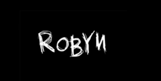
Many films incorporate a brand identity and this is important in film as you are advertising across multiple media platforms and would therefore want to create an identity for the film. As well as using a recognsieable slogan, the consistent use of colors, themes and font style will create a visual identity to which audiences would be engaged by and recognise. In both our trailer and our poster, we have incorporated the sketch like font and the effect of having this consistency of font style is that audiences will remember it and recognise it.

 Another way in which we feel like a brand identity has been created is through the use of imagery in both ancillary texts. We have used an image of our antagonist in both pieces of our ancillary texts and the reason for doing this for both is to specifically create a brand identity for the trailer. The images that we have used in both are extreme close-ups revealing the antagonists face in a lot of detail. The close-up also reveals the direct eye-contact that is being made. This is effective in engaging audiences and making them feel involved; as well as creating a visual image for the audience to remember and with the women being the antagonist and key enigma character in our trailer, when it comes to watching the trailer, audience will recognise the character and may have already made assumptions of what her role may be as a result of viewing the magazine and poster. The positive effect of making audiences think this way is that it will be the case of them being able to associate a thought or assumption with our trailer and we feel more engaged and intrigued by it; and as result will remember it - creating a brand identity.
It is also recognisable that the facial expression of the women in both is the same/very similar and the effect of this is again that audiences will remember it - for being quite an eerie look, conventional of a horror. The black and white effect that we have incorporated into our poster follows the theme of contrasting colours that we have used throughout making it rememberable for audiences.
 In our products, we feel like the main feature that is creating a brand identity for us is the use of the slogan 'Your fears are what you create'. We have used this title specifically in our trailer but then further incorporated it into our trailer poster. The effect of doing this is that audiences will recognise the film through having something to remember it by - rather than just the name of the film. The direct address in this slogan where we have used the personal pronoun 'you' is also significant in engaging audiences, and making the feel more involved and a part of the trailer. Through directly addressing the audience, our brand identity would essentially become more identifiable as they will be likely to remember their personal involvement/engagement in the trailer.
Many films incorporate a brand identity and this is important in film as you are advertising across multiple media platforms and would therefore want to create an identity for the film. As well as using a recognsieable slogan, the consistent use of colors, themes and font style will create a visual identity to which audiences would be engaged by and recognise. In both our trailer and our poster, we have incorporated the sketch like font and the effect of having this consistency of font style is that audiences will remember it and recognise it.

 Another way in which we feel like a brand identity has been created is through the use of imagery in both ancillary texts. We have used an image of our antagonist in both pieces of our ancillary texts and the reason for doing this for both is to specifically create a brand identity for the trailer. The images that we have used in both are extreme close-ups revealing the antagonists face in a lot of detail. The close-up also reveals the direct eye-contact that is being made. This is effective in engaging audiences and making them feel involved; as well as creating a visual image for the audience to remember and with the women being the antagonist and key enigma character in our trailer, when it comes to watching the trailer, audience will recognise the character and may have already made assumptions of what her role may be as a result of viewing the magazine and poster. The positive effect of making audiences think this way is that it will be the case of them being able to associate a thought or assumption with our trailer and we feel more engaged and intrigued by it; and as result will remember it - creating a brand identity.
It is also recognisable that the facial expression of the women in both is the same/very similar and the effect of this is again that audiences will remember it - for being quite an eerie look, conventional of a horror. The black and white effect that we have incorporated into our poster follows the theme of contrasting colours that we have used throughout making it rememberable for audiences.

No comments:
Post a Comment